Yahoo logo change came as a surprise to many of us. Frankly speaking, not most of us were considering a major change in Yahoo logo. That too, stuck us at a time when Google is in the limelight. But well Yahoo changed its logo design. According to some sources, Critics do not like this change in the logo design and most are ‘not impressed’. But Marissa Mayer thinks the opposite ‘we’re really happy with where we ended up. We hope you are too!’
If we analyze the situation, why Yahoo needed a logo design change? Yahoo had a good logo and if we think about yahoo users, most were not fed up by the old one yet. Then why so suddenly the logo change came? Is Yahoo trying to change the dynamics of search engine industry? Or is it trying to make some major move like Microsoft?
Let’s take a look at the sudden change and analyze the story.
Most of the changes the internal public wanted in its corporation’s logo design was the use of a Capital font, tilt in the exclamation mark, variable baseline and variable sized letters.
But whatever it is, Yahoo is trying to prove its mettle. Let’s see what the future holds for the biggest search engine of one time.
 |
| Image by CNN |
If we analyze the situation, why Yahoo needed a logo design change? Yahoo had a good logo and if we think about yahoo users, most were not fed up by the old one yet. Then why so suddenly the logo change came? Is Yahoo trying to change the dynamics of search engine industry? Or is it trying to make some major move like Microsoft?
Let’s take a look at the sudden change and analyze the story.
Its logo was not updated for 18 years:
According to Marissa Mayer’s blog on Tumblr, which Yahoo already bought, the logo was not updated for 18 years. This makes an excuse for the 38 year old CEO to try her Adobe illustrator skills and make some changes. But, wait; there is more to the story. Yahoo is detecting a decline in its search engine rankings. Most people are moving from Yahoo to either Bing or Google. It can be supposed that the logo change is a move to make an alteration in brand marketing and fetch back its old users.Marissa Mayer is dangerous with Illustrator:
Before you try to challenge Marissa Mayer in custom logo designing, you should know that Marissa Mayer is ‘dangerous’ with illustrator. We are not uttering it by ourselves. Marissa Mayer, herself, blogged about it on her Tumblr blog.Because straight lines are not so human!
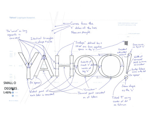
Human body is shaped in a way that is neither linear nor a proper curve. And that is what Yahoo wants to see in its logo design. The new yahoo logo has no straight shapes in it. Because Marissa Mayer thinks ‘Straight lines don’t exist in the human form’ so to furnish a human touch in the logo design, it demands that the logo be made with slight curves. |
| Image by marissamayr |
It’s most readable when uppercased:
The display usability of old monitors demands that all writings should be in sans serif fonts. Most capitalized elements on websites in sans serif fonts are considered more readable than de-capitalized or serif fonts. Yahoo also chose a logo that has a sans serif font and ‘scallops’ on ends.87% employees wanted change in logo:
No doubt that most of the critics on internet are criticizing the yahoo logo. Well some are showing affirmation too. But the real public of the company for whom the logo is being made is the internal public of the organization. After all it’s them who will have to see the logo on every wall of the building. And its good news that 87% employees of Yahoo, who wanted a change in the logo design, got their desire fulfilled.Most of the changes the internal public wanted in its corporation’s logo design was the use of a Capital font, tilt in the exclamation mark, variable baseline and variable sized letters.
The Chiseled Triangular depth makes ‘Y’ appear on each letter:
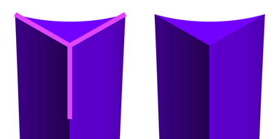
Like we said in our previous post, ‘every logo has a concept behind it’, Yahoo logo design also is made with some hidden facts that are not noticeable in the first go. But if we look closely at the Yahoo corporate logo design, the logo has a chiseled triangular depth on each letter. This chiseled effect is made in the shape of a triangle that forms a ‘Y’ on each letter of Yahoo logo design. |
| Image by marissamayr |
Well, Yahoo seems Happy with its logo!
People, most probably psychologists, advise us that we should not care what people think or say about us. That is the way to success. And Yahoo seems to be following the same advice. If not Yahoo, Marissa Mayer is.But whatever it is, Yahoo is trying to prove its mettle. Let’s see what the future holds for the biggest search engine of one time.
Sources:
Marissa mayr Blog
No comments:
Post a Comment
Please do not use abusive words.