Logo design is a complex and time consuming task. Designers try to design logos with their utmost efforts but sometimes the illustrations they have made in the logo design are often not understood by the public, for whom the logo is being designed.
(Image Source:
Funny Capture,
Webneel)
A good logo is sometimes considered the element of success for a company. But a bad logo can be a disaster to it.
Here are some of the logo designs that have gone wrong and ruined their company reputation.
The company logo of A style got patented in 1991. The logo might be okay for the people living in those years. But as the youth today thinks a little differently the logo has become an internet sensation. It's been discussed around the internet and thanks to
Massimo it became a street wear product.
The all famous Youth Commission Logo. This logo was built in 1973, in those years the mentality of the public was different from today.
Nowadays, this logo is not seen as a good logo. But as some things are better showed than saying. That is why We prefer you see and decide for yourself.
Some Logo designs become so famous in the wrong sense that they indirectly impact the reputation of the company and make the name of the company changed. Well the name did not change in this case, however Clinica Dental is not termed by most of the people in San Marcelino as 'Full Time Practitioners".
This new logo for OGC (Office of Government Commerce) was designed in 2008. And according to
Telegraph, the design took 14000 Euros to be designed. It's an irony that the company who took 14000 euros did not turn it sideways.
OGC, however, feels that the logo will not have any negative impact on the institute and they are still using it as their logo.
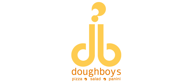
This is a company that offers food services of Pizza, Panini and Salad. Well, everything looks good about the company except the logo. The logo of the company...er...would have looked better if different font styles were used.
Check it out and decide for yourself.
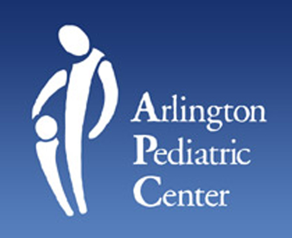
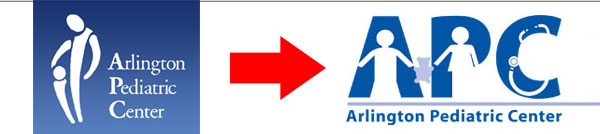
The Arlington Pediatric Centre is considered one of the finest Pediatric centers in Virginia, USA. It is a not for profit company that provides Medical services to children. However, their previous logo gained some negative attention and is still viral on the internet.
The logo made people think what kind of services APC provides to children...Now they have changed their logo to a new one but still that logo is getting attention for its association with the fish market (check out letter C - looks like crab).
 |
| Old Logo (Image Courtesy - GGPHT) |
 |
| New Logo (Image Courtesy - GGPHT) |
 (Image Source: Funny Capture, Webneel)

No comments:
Post a Comment
Please do not use abusive words.