Corporate Logo designs are an essential part of Small and Big Enterprises. All those companies who are the multi national giants today reached that lot by demonstrating artistic and innovative abilities. One of those abilities was the concept behind the corporate logo design and strategy of those companies.
Let’s inspect some of the companies and their logo designs to uncover the concept behind them.
If you are on internet for some time, you must be familiar with the logo design of Amazon.com. Amazon.com has a logo design that forms a smile. If we look closely, the smile changes in to an arrow that points from A to Z. This shows that Amazon.com sells every thing from A to Z.
Those who are in commerce know the work of FedEx Company. FedEx logo is a text based logo design. The color of ‘Fed’ is purple and ‘Ex’ is orange. But the custom logo design analysis doesn’t just ends here. If we look closely at the FedEx logo, it shows an arrow between ‘Ex’ of FedEx. The arrow is pointing towards right side of the logo. This pointing depicts the ‘right direction’ of the company and the speed as well as accuracy in reaching the target.
Sony has expanded its brand name VAIO. The name is often seen on notebooks, laptops and desktop computers produced by Sony. One often thinks why SONY used VAIO. The term VAIO means (Visual Audio Intelligent Organizer). However, there is a hidden meaning to the brand. ‘VA’ in VAIO forms an analog wave in the logo design. And ‘IO’ in VAIO resembles the ‘0’ and ‘1’ binary digits. In simple, the brand articulates ‘from digital to analog’.
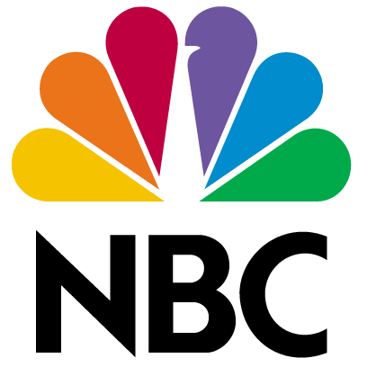
NBC Network also known as National Broadcasting Company is an American national broadcasting network. Do you know, NBC network is also known as the ‘Peacock Network’? It is called like that because the corporate logo design of NBC network depicts the shape of a peacock with wings wide open. Another strange thing about the NBC network logo design is that it has three primary colors and three secondary colors in its corporate logo design. The primary colors of the logo design portray network divisions of NBC, such as Sports, News and Entertainment. At the same time, the secondary colors represent the Station, Network and Production divisions respectively.
These are some of the famous logo designs. The concepts behind the custom logo designs of these companies give a clear picture of the brain work done by illustrators for the branding of these companies.
Let’s inspect some of the companies and their logo designs to uncover the concept behind them.
 |
| Image inBlurbs, Author - Dragan Mestrovic |
1. Amazon.com:
| Image by Typhon on Wikipedia Commons |
2. FedEx:
 |
| Image by Cmonville (CC by 3.0) |
3. Sony VAIO:
| Image by Orsorama, Source - Flickr |
4. NBC Network:
 |
| Image by Wikimedia Commons |
These are some of the famous logo designs. The concepts behind the custom logo designs of these companies give a clear picture of the brain work done by illustrators for the branding of these companies.
No comments:
Post a Comment
Please do not use abusive words.